

This post covers creating a dashboard in Grafana and displaying data from Log Analytics. My previous post covered connecting a Grafana installation to a Log Analytics workspace. That post can be found here. The examples below are intended to give the reader an overview of options to help get started with Grafana.
A Grafana installation connected to a Log Analytics workspace is required to complete the steps below. In addition, the workspace needs to be configured to collect performance metrics “% Processor Time” and “% Committed Bytes in Use.”
Percent Processor Time
Start by logging into Grafana and clicking the “+” button on the left. This will create a new dashboard.
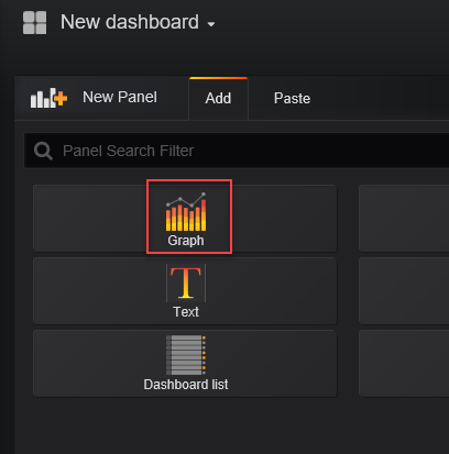
The first element will track % Processor time with a graph. In the New dashboard, click Graph.
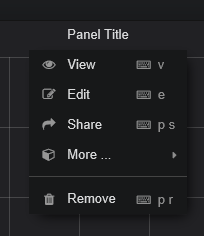
Select Panel Title and Edit
Select the General tab and give the chart a name and a description.

After giving the chart a name, go to the Metrics tab. This is where the query will run. Change Service to Azure Log Analytics and the Workspace to the workspace you are monitoring. An example will show in the query window, the example can be removed.
Below is a query used in Log Analytics to return timechart of % Processor Time:
Perf
| where ObjectName == "Processor" and CounterName == "% Processor Time" and InstanceName == "_Total"
| summarize avg(CounterValue) by bin(TimeGenerated, 5m), Computer
| sort by TimeGenerated asc, Computer asc
| render timechart
First, remove the last line,”| render timechart”, we don’t need that as we are building a chart in Grafana. Enter in the rest of the command and select run. It should look something like below.

That worked, but there are a couple of issues. The servers with names starting “WIN-” have been offline for a while and should not show in the results. Also, there is a message on the screen indicating “Data points outside time range”. You may also notice that the Y Axes goes to 125. Processors don’t go to 125 percent, so that is incorrect. The below adjustments will resolve these issues and better format the graph.
A change to the query is needed next. Grafana uses macros to make writing queries easier. Read all about them here https://grafana.com/plugins/grafana-azure-monitor-datasource. Adding the line “| where $__timeFilter(TimeGenerated)” right after Perf in the query will help substantially with formatting and remove the error message. Below is the query with the added line.
Perf
| where $__timeFilter(TimeGenerated)
| where ObjectName == "Processor" and CounterName == "% Processor Time" and InstanceName == "_Total"
| summarize avg(CounterValue) by bin(TimeGenerated, 5m), Computer
| sort by TimeGenerated asc, Computer asc
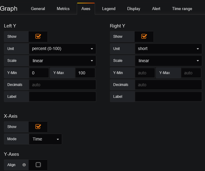
Once that’s updated, go to the Axes tab. For Left Y, change Unit to Percent (under the None menu). Change the field Y-Min to 0 and Y-Max field to 100. Once finished it will look like this:
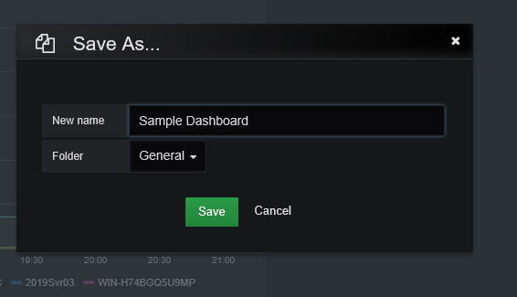
Close the graph edit window with the “X” on the right side of the screen. The graph will be visible in the top left of the dashboard. The next step is to save the dashboard. On the Right Top of the screen is the save button. Click that and give the dashboard a name.

This looks good, but notice that it’s not updating. To configure the dashboard to auto update, click on the clock in the top right.

From this window, you can change how far back the graph will display as well as how frequently it refreshes. In the Image below, the range is changed to 3 hours and set to refresh every 1 minute. Don’t forget to hit Apply after setting the refresh frequency.

Percent Committed Bytes in Use
Next up is another graph of % Committed Bytes in Use. Add the new graph using New Panel icon at the top of the screen.


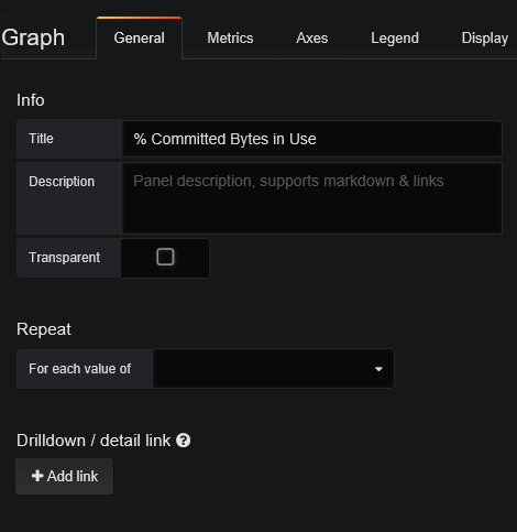
Edit the panel and give it a new name under the General tab.
Add the query below to the Metrics tab. This is similar to the % Processor time, only changing the ObjectName and CounterName for the new metric.
Perf
| where $__timeFilter(TimeGenerated)
| where ObjectName == "Memory" and CounterName == "% Committed Bytes In Use"
| summarize avg(CounterValue) by bin(TimeGenerated, 5m), Computer
| sort by TimeGenerated asc, Computer asc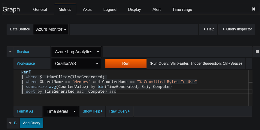
Move onto the Axis tab and change Unit to Percent and change the Y-Min to 1 and Y-Max to 100.
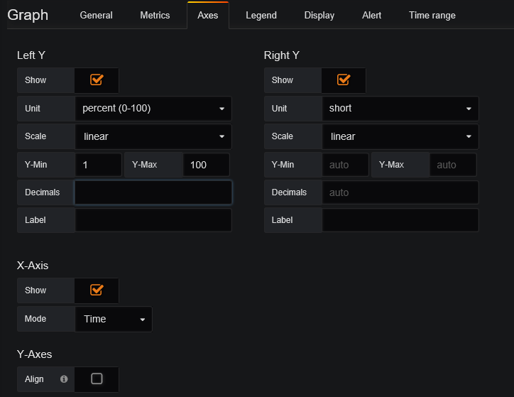
Close the Graph editor to return to the dashboard. Click the Save icon in the upper right to save the changes.
Monitored Servers
The next item is a list of all monitored servers. This example demonstrates creating lists in Grafana. This specific view may not be useful in environments with a large number of servers. If that’s the case, the query can be modified to show something more useful.
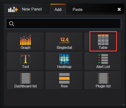
Start by adding a new panel and this time select Table.
Edit the new Panel. Go to the General tab and update the title, move the Metrix tab. Below is the query. It simply uses the Heartbeat table to list computers reporting over the past 48 hours.
Heartbeat
| where TimeGenerated >= ago(2d)
| distinct Computer
| order by Computer desc
Add the query and change the Format As field to Table as shown below.
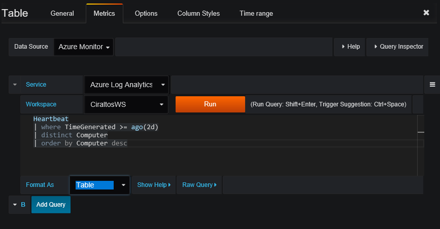
Exit the Table Editor with the “X” on the right side of the screen and save the updated dashboard.
Computers Missing Heartbeat Past 5 Minutes
The last example will identify servers missing heartbeat data, and possible down, in the last 5 minutes.
Start by adding and editing a table similar to the previous example. Change Title under the General tab to “Computers Missing Heartbeat Past 5 Minutes”.
Once finished, go to the Metrics tab and enter the query below. This query reports on computers that have reported in the past 24 hours, but missing heartbeat data in the last 5 minutes.
Heartbeat
| where TimeGenerated >= ago(1d)
| summarize LastCall = max(TimeGenerated) by Computer
| where LastCall < ago(5m)
Change the format to Table. Once finished it will look like the example below.
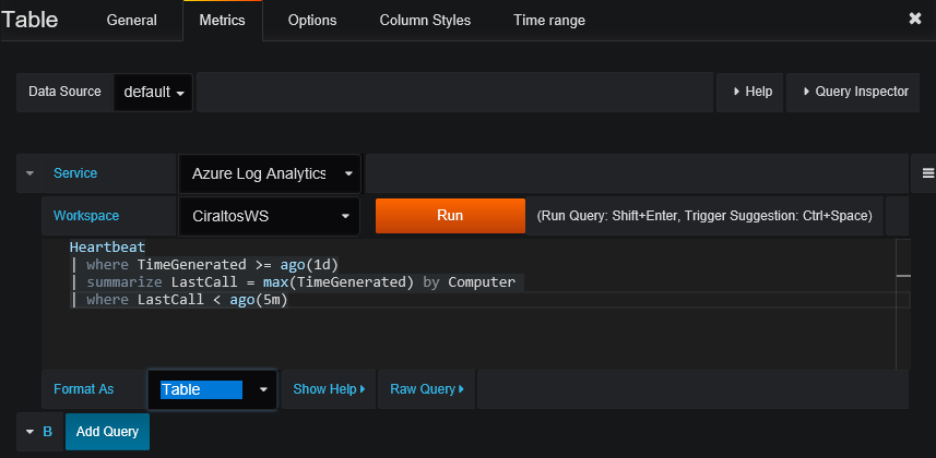
The example below shows computers missing heartbeat information, but there are a couple of things to change. The Computer column header should read Offline Computer and the date time format LastCall column should be a more readable format.

Go to the Column Styles tab and Click the + Add button to add a new style.

Modify the filed under Options similar to below. This changes the Computer Column header in the table
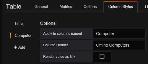
Add a second Column Style to change the format of the LastCall Column. Modify it to match the example below. Use whatever Date Format works best for you.
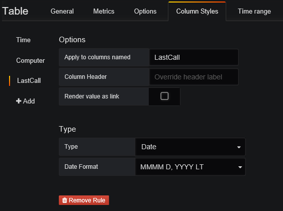
Exit and save the dashboard to finish.
Change Layout
The Sample Dashboard shows the items created but probably doesn’t look too good at this point. Move and reorder the panels by selecting the title bar and dragging them to a new position. The panels can be resized using the resize button on the lower right side of the panel. Click on the animation below to see a demonstrates on how to move and resize panels.
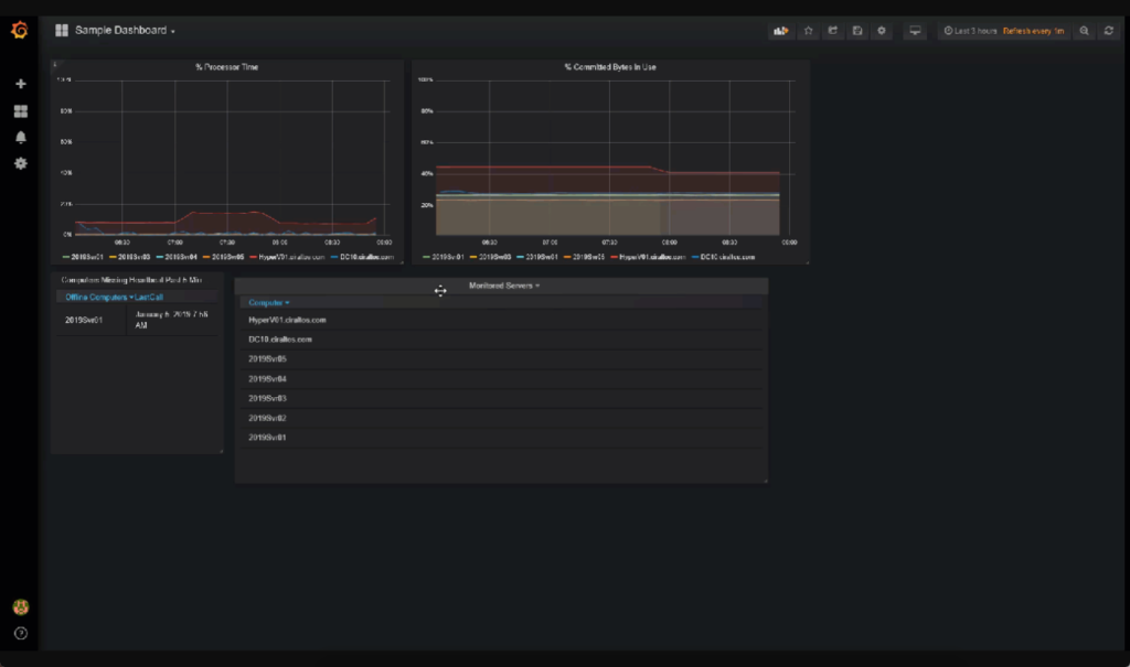
That is all there is to it. The goal of this post is to show how to add visualizations to Grafana. Hopefully, this was enough to get you started in visualizing Log Analytics data.
